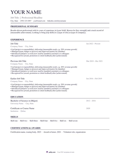
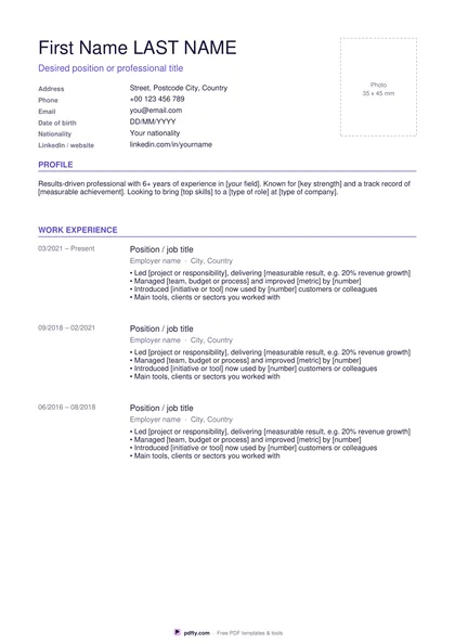
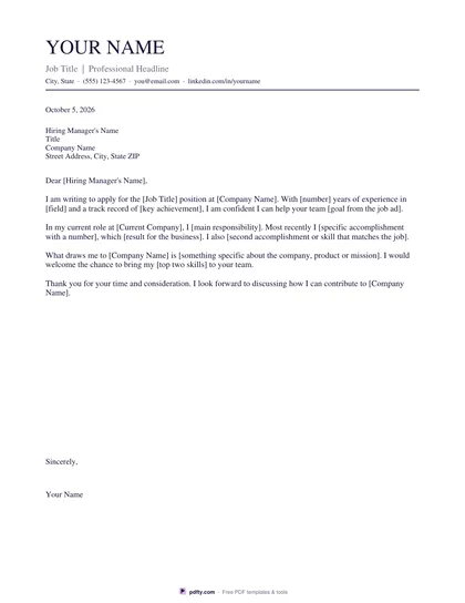
Job Offer Comparison Chart (Fillable PDF)
Two or three offers side by side across thirteen factors, with a weight for each factor and a weighted total at the bottom.
Free · no watermark · no sign-up for your first 20 downloads a day
Fillable PDF — type into the fields online or in any PDF viewer before printing.
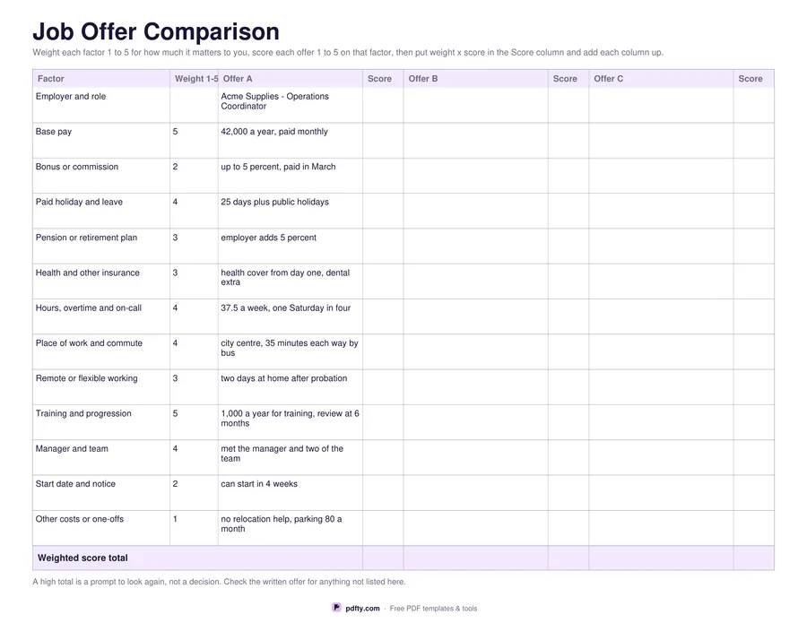
A landscape sheet with one row per factor and a pair of columns per offer, one for the detail and one for a score. The thirteen rows cover the employer and role, base pay, bonus or commission, paid holiday and leave, pension or retirement plan, health and other insurance, hours and overtime, place of work and commute, remote or flexible working, training and progression, manager and team, start date and notice, and other costs or one-offs such as parking or a move.
The weight column is what makes it more than a list. You score each factor one to five for how much it matters to you before you look at the offers, score each offer one to five on that factor, multiply the two and write the result in the Score column. The bottom row totals each offer. A high total is a prompt to look again at the row that produced it, not an instruction, and the note at the foot of the sheet says so.
The first offer column arrives filled in with a worked example so you can see the level of detail that helps: not just a salary but how it is paid, not just a commute but how long it takes and by what. Choose two offers for a wider detail column or three to fit a whole shortlist, and US Letter or A4. Every cell is a form field, so you can fill it in on screen, or print it and work through it with a pen while you have the written offers in front of you.